Tuesday, 15 September 2009

The Forever Story


Created by CHI & Partners, the forever story is an online, collaborative writing experiment they hope will become the worlds longest story. Company Talk Talk are donating £1 for every part of the story submitted. These donations are going to the charity Treehouse that helps children with autism. The first thirty five words of the story have been written by Nick Hornby, and go like this :

"For the first nineteen years of his life, Johnny Razor wasn't Johnny Razor at all. He was Malcom Weatherly, and was born in Mile End Underground station on the night of 17th September 1940"

Other well known writers have also contributed, however it is free for anyone to publish their own piece of the tale. It is fascinating to read from the beginning, how the contributions from different writers take it in a new direction or puts an alternative spin on the story. Also interesting is how much better the story becomes being collaborative and putting everyones ideas together, rather than if just one person had written it. I think the same can be said for all creative work. All together I believe this is a really engaging, unique and clever promotional idea, and portrays Talk Talk's, life's for sharing ethos, whilst also going towards a good cause.

Monday, 14 September 2009

'It's not how good you are, It's how good you want to be'

Paul Arden has written several books on advertising and motivation, having sold more than half a million copies I thought this one must be worth reading after being drawn in by the intriguing title. Paul Arden is known throughout the advertising industry as a creative genius, however sadly died last year. He was creative director at Saatchi and Saatchi and worked there for fifteen years. Responsible for campaigns such as British Airways, Silk Cut, The Independent, and Toyota, he has left quite an impression upon the advertising world. I was therefore interested to hear his words of wisdom. 
'Its not how good you are, it's how good you want to be' is a witty and entertaining guide to making the most of yourself. Arden offers lessons of advertising and business. As a student this book is very helpful, giving an insight into the professional world of advertising and how to succeed. Arden also emphasises the need for mistakes and criticism to learn and improve. "The person who doesn't make mistakes is unlikely to make anything". Saying it is better to do something wrong and use your initiative than not do anything at all. Most relevant to me, he states that we should not look for praise in our work, but seek criticism and ask what is wrong with it. So often I feel disheartened from negative feedback, but rather than take it to heart I need to look at it constructively. After all there is nothing to be learnt from a tutor telling us how good our work is. I think this is a very important lesson to take from this book; to take a more positive attitude to mistakes and criticism. That and the need to aim high and be as motivated as possible.
Here are a few quotes that stood out for me:

"Nearly all rich and powerful people are not notably talented, educated, charming or good looking"

"Your vision of where or who you want to be is the greatest asset you have"

"Talent helps but it wont take you as far as ambition"

"Everybody wants to be good, but not many are prepared to make the sacrifices it takes to be great"

"Aim beyond what you are capable of" 

Sunday, 13 September 2009

The Shawshank Redemption

Shawshank Redemption must be at the top of almost everyones list of favorite films. I for one found it an extremely inspirational and heart felt story. I was therefore shocked to hear that when it was first released, it was a complete flop at the box office and barley made enough money to cover it's budget. 
Created by first time director, Frank Darabont, the film is almost entirely set in Shawshank state prison. For the few who haven't seen the film, city banker Andy Dufresne is sent to Shawshank after being wrongly convicted for murdering his wife and her lover. Whilst there his quiet strength and integrity gradually earns respect and friendship of prison inmate Red, played by Morgan Freeman. Andy also becomes popular with the warden and prison guards by providing them tax and financial services. Despite Andy's apparent acceptance of his unjust punishment, he is determined for freedom. Freedom and hope are central themes to the film - "Fear can keep you a prisoner. Hope can set you free". A particularly moving scene for me is when Brooks Halten is released from Shawshank and finds the outside world so fearful he would rather take his own life than live a free man. The characters in Shawshank have become institutionalised and do not know how to live outside of prison, this is also evident when Red is released on parol after serving forty years there. He does not know how to live outside Shawshank's strict regime and fears that like Brook Halten, he may too end up committing suicide. The main message the film leaves the audience with, is hope. Red finds this in Andy's letter to him at the end of the film, "Hope is a good thing, maybe the best of things, and no good thing ever dies". Showing that hope and optimism can be found even out of the most bleak circumstances. It is this feel good ending and strong, from the heart message of the film that makes it so inspirational and uplifting classic.
When released in 1994, Shawshank Redemption was nominated for seven academy awards; Best picture, Best Actor - Morgan Freeman, Best Adapted Screenplay, Best Cinematography, Best Editing, Best Original Score and Best Sound Mixing. However in the shadow of Forrest Gump, also released at the same time, it was unable to win a single award. The film received negative reviews from critics, notably Kenneth Turan from the Los Angeles Times, who called the film "dwonright hateful", and that it "makes us feel like were doing harder time than the folks inside". I find these reviews difficult to understand considering the consistent warm reception of the film today. I can only think that it's failure at the box office was a that on it's description, the public did not deem it worth seeing at the cinema. If I had not seen the film and it did not have the reputation it does today, I don't think I would want to watch it from the description of the story. Set mainly in a prison, with little presence of any women characters, by an unknown director, the story doesn't sound very cinematic, more like a dull prison break out film. The thought provoking message and empathy in  the film is unexpected, but is what makes it such a crowd pleaser. It was only when Shawshank Redemption was released on dvd that it it began to receive some attention, from then on, word of mouth has given this film a resounant afterlife.


9/11 Memorial


As we pass the eighth anniversary of the September 11th tragedy, we see a new identity for it's memorial and museum, coinciding with the opening of the new 9/11 preview site. The name has been shortened considerably to a far more simple 9/11 Memorial, the aim of this was to make it more distinctive to the public. Created by Landor, the new identity reinforces the spirit of rebuilding. The clever highlighting of the '11' represents pillars of strength and solidarity, whilst also making reference to the twin towers. I think the identity is appropriate for such a sensitive issue, it is strong, simple and to the point, yet respectful. The symbolism of the '11' is also a clever device and adds a nice touch. 
This identity is for the new memorial and museum dedicated to september 11th and will be ready to open in 2011 on it's 10th anniversary. The 9/11 preview site enables the public to view models, artifacts, images and stories and watch the development of the memorial and museum being built. 


The design for the memorial was chosen from a competition of 5200 entries. Below is the winning design by architect Michael Arad and landscape architect Peter Walker.


The memorial covers eight acres in total, the main feature being 2 giant pools in the footprints of the world trade centre buildings. The pools will have the largest man made waterfalls in the country cascading into the bottom of each. I really admire this design, it emphasises the absence and feeling of loss in the middle of the city using the two large voids, whilst creating a beautiful space to visit. It is a powerful reminder of the buildings and the lives lost. The new identity and plans for the memorial does create a sense of the city rebuilding and moving forward. 

Friday, 11 September 2009

London's Olympic Stadium

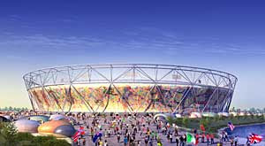
Still recovering from the painful sight of the London 2012 Olympic logo, I saw the pictures for the new Olympic stadium last week, which sadly, I cannot say is any better. "No one can say wev'e compromised on design, on sustainability, or on the legacy potential', says olympics minister Tessa Jowell, I beg to differ. The Olympic stadium maybe practical, but it is dull, underwhelming and doesn't fit into the landscape around it. The initial concept has been changed to a more economical version that allows for 80,000 seats to then be converted into a 25,000 capacity stadium after the games.

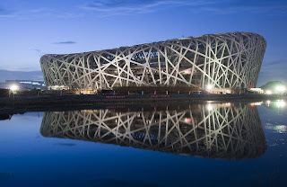
After seeing the Super Contemporary exhibition that celebrated London's worldwide creative reputation and achievements, I have to wonder why this building doesn't use that opportunity. The Olympics is the one time for Britain to show off it's creative talent to the rest of the world, and the Olympic stadium doesn't do justice to portraying our diverse architecture. Especially in comparison to the 2008 Beijing Olympic Stadium which is a fantastic piece of architecture that celebrates China's culture. Also known as the birds nest, the 


stadium is imaginative and aesthetically pleasing, and looks more like a work of art than a sports arena. It also compliments the landscape around it, whereas the London stadium sticks out like a sore thumb. 
The London arena certainly reflects our current economic climate. It has been built to be practical and sustainable, seating a high capacity, with very little thought to aesthetics. There has been no concept, imagination or creativity in the design of the building. I agree with the critics who say it looks like 'a fruit bowl'. Tom Dykhoff, The Times' architecture critic wrote that the 2008 and 2012 olympics will be seen in years to come by historians as 'a cunning indicator of the decline of the west and the rise of the east'. 
Whilst it is important to set a budget in these economical conditions, does that really mean at the sacrifice of good design?

Guess Who? The many Faces of Noma Bar


Noma Bar is an artist I have recently come across and I have taken an instant liking to his striking and genius illustrations. A collection of his work has just been published titled 'guess who: the many faces of Noma Bar'. His illustrations are of celebrities and political figures, drawn using symbols to convey the character or person. The portraits are produced from very few elements, using negative space, which gives Noma Bar a minimalist but very characteristic style. For instance, Uri Geller's face is created from a bent spoon. The symbol in the illustrations gives us a clue as to who the person is. The book is very entertaining and I find his illustrations extremely clever and graphically interesting. I cant believe how much they look like the characters they are supposed to be using so few and basic elements.

Bob Dylan

Margaret Thatcher

Uri Geller

Harry Potter
Ricky Gervais

Super Contemporary at the Design Museum


I was really impressed by the Super Contemporary exhibition showing currently at the Design Museum. A lot of detail has gone into the entire exhibition, even the branding of it. Super Contemporary is an exhibition celebrating London's creative community and it's achievements, both past and present. It explores what gives the city its reputation as a beacon for design worldwide, and shows it's creative progression until present day. The focus of the exhibition is 15 specially commissioned pieces by some of the cities most talented creatives, that address London's culture and characteristics. Around the walls of the room is a visual timeline, beginning at 1960, documenting London's creative ascent and key achievements in design. I found it particularly interesting as you can see the impact that culture has had upon design in the past as a chronological order. 
 
Neville Brody's commission was very thought provoking, it looked at the issue of a city overrun with surveillance where you are constantly being watched. His response was a self contained, sound-proof booth; a rare example of a public space that wasn't being monitored. 

The website for the Super Contemporary exhibition is also very good. They have used the interesting logo as a clever navigational tool that works very effectively in the design and to get around the website. The design echoes the layout of the exhibition which is visually striking and also easy to gain information. It gives detail of the overall exhibition and each of the 15 commissions. I find it a very effective piece of online work that compliments the exhibition well, which runs until the 4th of October, and is definitely well worth a visit. 

Thursday, 10 September 2009

Posters from the London Underground


I was very interested by the Art On the Underground Project as posted previously, and took a look at the London Transport Museum's website. It contains an online collection of posters from the London underground that date back to 1900. However I was particularly interested by these below from the 1980's. The reason being that these posters are purely aesthetic, they are not advertising or selling anything. During the 1980's, due to increased fares, there became a drop in passenger numbers. That resulted in a decline in the demand for advertising space, and these empty spaces were covered with sheets of black paper. The idea came from this to fill the empty spaces with artwork, enriching passengers environment and their experience on the underground.
I particularly like the two posters below, due to their graphic appearance and symbolic representation of the underground. They are similar to many of the designs produced today.
 

Posters like these are still used today in projects such as Art On The Underground, and Platform for Art. They certainly grabbed my interest whilst traveling on the tube at the weekend and I think it is an interesting idea, making a dull journey a little more enjoyable. The London Underground must be one of the most effective spaces to showcase and exhibit artwork due to it's size and the volume of people traveling on it each day. A great way of getting new artists recognised and showing off Britain's modern art whilst making the underground more pleasing to the eye. Below are some of the more recent posters used. 


Art On The Underground

Since it is over a year that I last travelled on the London Underground, I was interested by the poster below I saw last weekend. To celebrate the 100th anniversary of London Undergrounds logo the Roundel last year, Art on the Underground commissioned 100 artists to produce new works to celebrate the logo. The artists, from recent graduates to renowned artists were asked to incorporate the Roundel into their work, and interpret what the logos mean to them today. I think the result is really effective, and a great way to celebrate this iconic logo. 


Seeing this reminds me of how successful the London Undergrounds branding is. The roundel is recognisable throughout Britain and has to an extent become a symbol for London itself and of popular culture. Designed in 1919 by Edward Johnstone, it has certainly stood the test of time. The sans serif typography, bold colours and simple design create such a strong symbolic image that the works above created for the 100th aniversary immediately remind us of the logo, even though some are ever so subtle. 

'Sketches' 1941-2005 Jan Kaplicky

Whilst visiting London last weekend I found time to take a look at the current exhibition at the Design Museum: 'Remembering Jan Kaplicky - Architect of the Future'. After walking for an hour from the nearest tube station, trying to find a poorly signed Design Museum, through a maze of streets, most of which in the wrong direction, I finally arrived at what turned out to be a rather disappointing exhibition. However, downstairs in the gallery's shop I found this intriguing book that had the inspiration I was looking for, that the exhibition had lacked.

'Sketches' is a unique book compiled from 60 years of Kaplicky's hand drawn sketches. These illustrations look so rare in todays digital world, their primitive, simple style is striking and full of character when compared to the far more clinical style a computer produces. They almost look as though they are quickly scribbled down as an idea has just been realised. The book consists of initial, very rough sketches and ideas, to more developed whole buildings or detailed, single elements. It is a very intimate experience to look through Kaplicky's sketches in this way, showing his chain of thought and private workings, most of which have never been made. The book is almost like a diary or log book in which the artist has developed over his lifetime and makes it feel very personal to the reader.