Friday, 28 August 2009

Kaplicky's Designs Live On


Architect Jan Kaplicky, known for some of the most innovative buildings the world has ever seen, died on January 14th of this year. However many of his best designs remain to be completed and may never be realised. His designs are remarkable in both their aesthetic and technical design. I like them most for their striking beauty and originality. Much of his architecture is influenced by organic forms, his design for the New National Library of the Czech Republic and the Prague Concert and Congress Centre remind me of water , even fish like forms.
Kaplicky won a competition to design the Czech New National Library, however due to controversial reaction to his proposal, plans for its realisation have been cancelled. I still find it's design extremely striking. Much like that of Concert and Congress Centre in Prague that is yet to be finished. I like the smooth, soft lines of both these buildings and the fluid forms.


Jan Kaplincky is more commonly known for his design of the Birmingham Selfridges store, which has become an architectural landmark of the city. Also the Natwest Media Centre at Lord's has been described as one of the most revolutionary buildings of the century. 


What I find even more interesting than the buildings Kaplicky has designed, is his chain of thought and the development of his work from ideas and sketches to the final form. This is evident on his company, future systems, website. 

"The world is full of beautiful things, and you have to be observant as an architect – if not, you are in trouble. Creativity is everywhere. ... The initial idea for a job comes to me literally just like that sometimes, and if that first idea is good then you are on the right track." Jan Kaplicky. This message is the purpose of this brief- to take influence and inspiration from what we see around us to broaden our creativity. 


I have found Jan Kaplicky's work extremely inspiring. The Design Museum are currently holding an exhibition of his work, his sketches and ideas, which therefore I will be visiting this weekend.


To be continued ...

Lancaster London Rebrand

Collectiva has designed the new Identity for the Royal Lancaster Hotel, now called Lancaster London. I think this is a great example of successful rebranding. 

The previous name and logo as shown below looks tired and old fashioned, whereas the new branding conveys a sharper message and has far more impact. It has a more high end, contemporary appearance due to its subtle typeface and colour. Whilst the name emphasises the hotels positioning and gives it more resonance. Showing that sometimes a message can be expressed more effectively through simple design.


Creative Review Packaging


My copy of Creative Review came in the post today in this rather intriguing packaging.  The cardboard envelop that contains the magazine can be made into a folder to hold the monograph booklets. A very clever, interactive packaging solution and handy too as most of my monograph copies end up getting lost or finding their way to the bin. Also addressing current environmental issues, as the packaging can be re-used for something else rather than thrown away. It is the first in a series of special creative review packaging solutions that explore different materials and concepts. 
This months magazine is also worth taking a look at as it is a whole issue dedicated to graduates. 

Monday, 24 August 2009

Dreams From My Father

I am currently reading Barack Obama's autobiography. Initially worried I may have found this book heavy going, and dare I say, a little boring as I am not particularly interested in politics, it has been very pleasantly surprising. This honest and beautifully written memoir retells Obama's improbable life story; of his parents- a black African father and a white American mother, of his childhood in Indonesia, and his personal struggle for identity and belonging. 

There are two reasons this book has held my attention throughout. First being Obama's descriptions of the race-relations in America as a child. I find it unbelievable how much society has changed in one mans lifetime, from being an outcast at his own school, to President of the United States. His story is one of self-creation, an embodiment of the American dream.

Most importantly, and most relevant to this blog, is Barack Obama's ability to communicate. It has assisted him to his political position and is what makes this book such a compelling and lyrical read. Obama's eloquence illustrates the power of language, how when used well it can communicate more effectively than any image. His words have the capacity to persuade, uplift and inspire his audience. All too often written language is overlooked in design and advertising, in favour of visual language. I think it is important not to forget the potential it bears. I wish to explore this further in my research, and find examples of language used powerfully in advertising and design. 

"With the right words everything could change- South Africa, the lives of the ghetto kids just a few miles away, my own tenuous place in the world." Barack Obama, 'Dreams From My Father'.

Sunday, 23 August 2009

Disney's Fallen Princesses

I love the concept behind artist Dina Goldstein's photography project. It places Disney's princesses in real, modern day scenarios. The happy fairytale endings are sad but realistic outcomes that address current issues affecting women today, alcoholism, fast food culture, self image problems, illnesses, to name a few. Goldstein was inspired by her three year old daughter and her fascination with princesses and desire to dress like them. 

These photographs interest me because they express the reality of our culture and society today. Conveying a sinister message by using a character that we associate with happy childhood memories, presenting a shocking contrast. I think this work also illustrates the naivety of children and the reality of growing older. Below are a few of my favorite images from the series, which are due to go on exhibition on the 15th October.


Tuesday, 18 August 2009

Postage Stamp Memorial

I saw this after writing my previous post and found the idea very similar. Artist Steve McQueen has created a project named Queen and Country to publish postage stamps with the faces of British soldiers who died in Iraq to commemorate their memory. The project is being supported by The Art Fund who are pushing for the stamps to be published by the Post Office and have set up an online petition
Steve McQueen proposed this idea after he returned from his visit to Iraq in 2003, "An official set of Royal Mail stamps struck me as an intimate but distinguished way of highlighting the sacrifice of individuals in defence of our national ideals"

Using postage stamps is an inventive medium for a memorial, that would provide a far more personal and direct experience and would engage with the public. I think this is an inspired idea, it is simple yet compassionate and most of all a sensitive way to commemorate the British soldiers that have died. I really hope this will be recognised and they will become an official set of stamps.


Monday, 17 August 2009

Afghanistan 2001-2009

Although I haven't been following the events in Afghanistan closely, I couldn't fail to notice the significance of the 200  British soldier death toll yesterday. This controversial topic has produced mixed reactions amongst the public and media, however is portrayed most graphically on the front page of The Daily Telegraph today, that commemorates the soldiers that died by showing each individual photograph. 
This image has left a much greater impression on me than any other I have seen about the Afghanistan war. Perhaps it is putting faces to the names and statistics, that shocks me so much. This front page is unlike any other I have seen of the telegraph, using only photographs and a headline in it's layout. As if it out of respect, dedicating it to the memory of the 200 British soldiers that died. 

The Guardian Podcasts

Branding has always been of great interest to me, and after looking at the 
well branded Absolut Vodka advert in my previous blog, I decided to search for more examples of 'good' branding. What I liked about the Absolut advert was how it portrayed the philosophy of the brand and looked so unmistakably like an Absolut advert. 


The same can be said for this print campaign for The Guardian podcasts, created by Wieden and Kennedy. The Guardian wanted to heighten awareness of their podcasts site; Wieden and Kennedy have achieved this by combining strong imagery through a collage of illustration, with interesting typography. Most importantly, they have kept in line with The Guardians sophisticated yet creative appearance. Without even seeing the brand name, I can recognise the advert as being that of The Guardian. Therefore the logo is shown discreetly in a different colour within the rest of the text rather than separately at the bottom of the page as in most adverts. The guardian have created such a strong and characteristic brand image for the newspaper which I believe is what makes their advertising so successful.


Absolut Vodka 'Anthem' Commercial


The advert consists of six genuine artistic installations created by artisans from different materials and environments to tell part of the Absolut story. "Doing things differently leads to something exceptional" is spelled out of ice blocks, wheat, hanging Absolut bottles, flying lanterns, balloons and glass cylinders. I really enjoy the beautifully crafted typography and the poetic manner in which the advert unfolds. However it is the clear, strong branding of the product that interests me most. The advert is very characteristic of the Absolut brand, recognised for it's outstanding marketing, and distinguishes it from other competitors. 

" 'Anthem' conveys our most fundamental brand belief and states Absolut has a long-term commitment to creativity", Anna Malmhake, global brand director at Absolut. 

Thursday, 13 August 2009

www.a-to-s.co.uk


I have been playing around on this website for the past fifteen minutes, so that must mean a good thing already. It is a promotional website for the mercedes car range, and although I am not at all interested in the product, or even much of the rest of the website, the opening home page has definitely caught my attention for some time. In our web design brief, the task was to engage with the audience, and this website does that brilliantly. 
Along the bottom of the page is the alphabet from A all the way to S, fitting to the product. These letters stand for a word that describes a benefit of the car and is revealed when rolled over with the mouse. When clicked on each letter reveals a different animation that you can control. As the picture shows above, when you click on the perfume bottle, sentences are released to describe the benefit. I think A, R, C and N are the best ones. I don't know if it would make you want to buy a mercedes , however it is a novelty idea and I find it refreshingly different for a car website. It engages with the audience whilst still being relevant to the product, and is a brilliant and clever piece of animation. Take a look, www.a-to-s.co.uk.

Harry Potter and the Half Blood Prince


I finally went to see the new Harry Potter film yesterday, having read the book and heard good reviews about the film, I left the cinema feeling slightly disappointed. The film has focused more upon scenes of humor, romance and the relationships between the characters rather than the action and magic of the previous films. Much of the detail from the book has been left out, and the supposed pivotal scene of Dumbledore's death is a bit of an anti-climax.

However, despite my overall feeling that the film was a little bit of a let down, there is one aspect that did surpass my expectations. When I look at the film from a graphic design perspective, the art direction and visual effects were spectacular. Displayed best in the dramatic opening attack on London, which shows evil sweeping into the normal world in black tendrils of smoke and destroying the London bridge. The idea to represent the death eaters through this image works perfectly, and the graphics are fantastic. The monochrome colour adds a sinister intensity to this scene whilst using famous London landmarks such as Trafalgar Square and the Millenium Bridge adds a more modern, real-world relevance to the film. It is a sensational opening that grips the audience at once. What else I found so impressive about the art direction, was the films ability to capture and interpret images from the book so creatively yet still so tangible. The set design of Fred and George's joke shop and that of the cave are better than I could have possibly envisaged from the book. 


Monday, 10 August 2009

Earth From Above

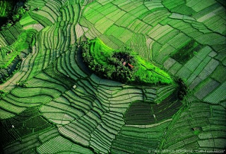
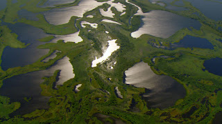
I was so intrigued by the Japanese crop art I posted previously, I decided to look at art and design from other places around the world; how it can mean different things and the different art forms used. I then came across these breathtaking shots by photographer Yann Arthus-Bertrand. These photos are just a few from 500,000 images captured from more than 100 countries as part of Bertrand's 'Earth From Above' project. The project was a journey around the planet to raise global awareness of sustainability. 
These stunning photographs embrace major ecological issues around the world and the threat they pose to our planet. Many depict scenes of natural beauty where global warming can be seen taking its effect. 
I really like the abstract quality of these images, some I cannot even tell what they are of. What I find most successful about them, is that the photographer manages to evoke the feeling of the need for change. Not only are the scenes in these photos so appealing, but they are exquisitely captured. Taking them from above is a clever idea, as it puts a different perspective upon the world that we don't get to see. It is almost as though from the ground we are oblivious of the damage we are causing, but when seen from above it becomes clear.

                                                             www.yannarthusbertrand.org

A film about the project so far can be seen at www.home-2009.com

Rice Paddy Crop Art


I saw this picture in an article from the guardian and found it so interesting I wanted to do some research on the subject. The image is a reproduction of artist Hokusai's famous print, "The Great Wave", created in rice fields by planting different coloured grains of rice. This agricultural artistry can be found in the village of Inakadate, Japan, where the rice paddy crop art exhibition has been a tradition for nearly sixteen years. Each year 8000 villagers help to create these works of art and more than 15000 visitors travel to witness the creations. 
'The Great Wave' is one of my favorites, not only is it visually beautiful, but the way in which it is produced must be admired also. This ancient folk art has been created with the help of computer imaging, without this technology, images of this scale and detail would be unimaginable. The farmers of Inakadate have used modern, sophisticated digital technology, however still maintained a traditional and folk appearance that draws from Japanese heritage. I admire how the Japanese farmers have embraced modern technology and combined it with traditional methods and art forms. It seems a wonder to me how sophisticated this crop art looks when it has been created from rice fields by the local community. 
Below are some more examples from previous years of rice paddy crop art. 


Friday, 7 August 2009

Harvey Nichols Window Display


Rarely do I walk past a Harvey Nichols Store and fail to notice it's consistently inventive window displays. The current designs for London fashion week are no exception, comprising of a complicated array of coat hangers to form dinosaur skeletons. Designer Janet Wardley is the creator of this inspired piece of work, and describes it as 'angular, prismatic and colourful', intended to be uplifting. 

Standing in front of the Leeds store this week, I felt more as though I were viewing a  window to an art gallery than a designer shop. What I find impressive about Harvey Nichols' window displays, is that they sell the image of the store rather than their products. The focus is on the dinosaur sculpture rather than the product in front. The design is simple and graphic; as a whole image you see the figure of a dinosaur. However looking more carefully, I was suprised to see the skeletal effect was acheived by using coathangers; a clever link to fashion and also visually stimulating. Wardley explained the sculpture of the dinosaur reflected fashions current obsession with "architectual cutting". I think her using coathangers to produce it from is an enlightened response that helps to give the window displays their  'wow factor', and definitely made me look twice. 


The Bauhaus Museum, Berlin

Top of my list of things to see in Berlin was the Bauhuas Museum. I have always been interested in the modernist movement and it's impact on design, and was therefore looking forward to seeing the work produced here almost ninety years ago. 

The Bauhaus appealed to the german population after world war one, as it was seen as a new beginning and a way of rebuilding a bankrupt Germany. However it's work produced there proved to cause quite controversial reactions. The actual building of the museum is Walter Gropius' late work and is a characteristic landmark of Berlin. Its unique shape is particularly striking when viewing the museum from outside.


The museum's bauhaus collection represents the entire range of the school's activities; art, architecture, metalwork, photography, furniture, textiles, and ceramics. Including pieces by famous teachers such as, Johannes Itten, Wassily Kandinsky, Josef Albers, and Oskar Schlemmer. The Bauhaus taught that an understanding of visual science would improve design. Focusing upon the formal elements of design in their work - colour, page layout, space, shape, line, texture and form. The work in the museum emphasises the Bauhaus' principles of form and function, they designed for a purpose and made art functional. 

I found this very prominent in their furniture and product design which are made up from few, simple shapes with no added decoration, giving them a very modern and minimalist appearance. The posters created in the Bauhaus appealed to me most of all, due to the clever layouts, strong typographic influence and colour used. The poster by Joost Schmidt is a good example of this as it shows all the elements of modernism. 


These principles the Bauhaus was founded upon can be seen so clearly in the work from the museum, and are what interest me most as I can reflect upon them in my own work. We are taught the same fundamental lessons in design as the Bauhaus taught so long ago and they still influence much of the art and design to present day. 


Monday, 3 August 2009

Berlin Holocaust Memorial


Having recently returned from visiting Berlin, one of the most memorable sights for me was the 19,000 squared metre memorial built in 2003, in honour of Hitlers six million victims. "The field of Stelae" as the memorial has been named, was designed by New York architect Peter Eiseman and consists of 2,711 free-standing concrete pillars of varying heights of up to 4m. This vast field of stone blocks rises and falls with the level of the ground, creating a wave-like form that can only be recognised by viewing it from above. It stands in the heart of Germany's capital and can be entered from all four sides.  

The erection of the memorial signified Germany's
 acknowledgement of it's tragic history and became a step towards it's postwar evolution. The designer intended for the memorial to be interpreted however we wish, however his concept for it was 'silence' as the victims had had their ability to speak taken away from them. Personally, it reminds me of tombstones in a graveyard representing the deaths of the victims.

What struck me most about the design was its massive scale, especially as it is positioned in such a central location, making it so unexpected to see. I think this helps to portray the scale of the suffering and horror caused by the holocaust and makes this memorial so unique and original to any other.